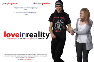


These are in the order of how I developed them. Apart from the first picture, the rest of the pictures are all posed for. I liked the mimimal look but after the first 3 posters thought that there seemed to be too much white/blank space, so decided to try incorporating another image or something to try and fill the page more. What I decided on was influenced from the 50 first dates poster, where they'd decided to use polaroid pictures to convey the idea that the two were dating. I tried replicating this but didn't think it worked well because I needed to have a background behind them. I therefore thought that I should maybe try taking some more photos with a relevant scenic background. I did also make the polaroid picture bigger on the second attempt of the poster and believed that it looked better than the first. My favourite image is of the one used in the most posters (2, 4 and 5). I liked the fact that she was looking up at him, and him down to her to show that they are making eye contact demonstrating the connection between them. I also think that the t-shirt the male is wearing is relevant as in the first poster he is wearing a metallica t-shirt which suggests his preferred music; despite helping to give more information on his character I thought that the more discrete and less obvious top looked better visually. My preferred poster out of these five (all created on powerpoint) is the last one, with the larger polaroid. However, I think it would look better with a background.
Points about my Posters:
- Colour Scheme, Blue+Red+Black=The Colours of the British Flag. The blue could represent the sadness of the ending, the red symbolises the love that the two share and the black represents the factual side of the "reality". By having a white background, it makes it easy to differentiate and see the colours and images.
- Apart from the titles in grey, everything else is in lower-case which is a convention I followed from the other posters.
- Another convention that I followed is the names of my actors that are in lower-case and the first name is in black whilst the surname is emboldened and coloured red.
- There are no spaces between the title of my film "love in reality" and the names of my actors. This is another convention I followed but I made sure that it was still readable by changing the colour or making certain parts bold.
Below are my finished posters. I decided to go for the minimalist look as I didn't want to give away too much about the film. Both posters are landscape and would be placed on billboards. I played around with the positioning of the images and text to create two different posters. The picture on the first poster was one I asked them to pose for; It represents how close they become in the film and how they are comfortable in each others company. Shannon is looking lovingly into Jonny's eyes whilst his serious face could be suggestive of the ending of my film. The second picture was taken from one of the original photos I took for my storyboarding. I liked it because of the action shot, but it shows how genuinely happy they both are. The main focus in both of these photos is on the images and the title. These were both created on photoshop.


No comments:
Post a Comment